User manual
Understanding the Windgram
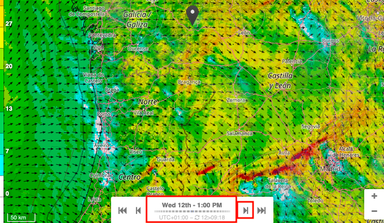
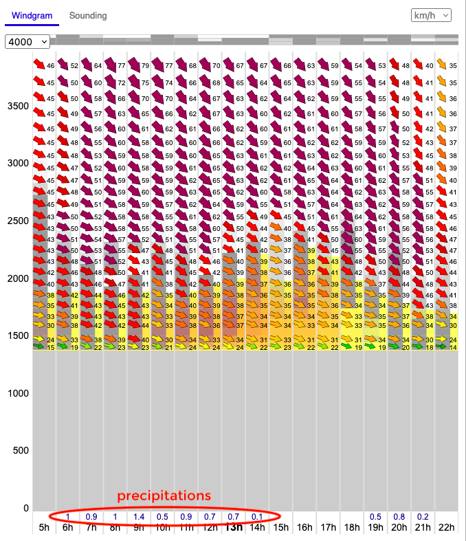
When you have clicked on your location on the map (right-side pane), the windgram corresponding to this location appears on the left.
Navigating the windgram: time and altitude
The Windgram vertical scale is at 4000m by default, but it can go till 10000 m.
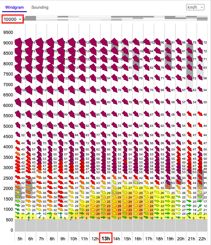
Note that the hour in bold on the bottom is the hour you have chosen on the map. You can change it using the scroller or the buttons on the bottom of the map.
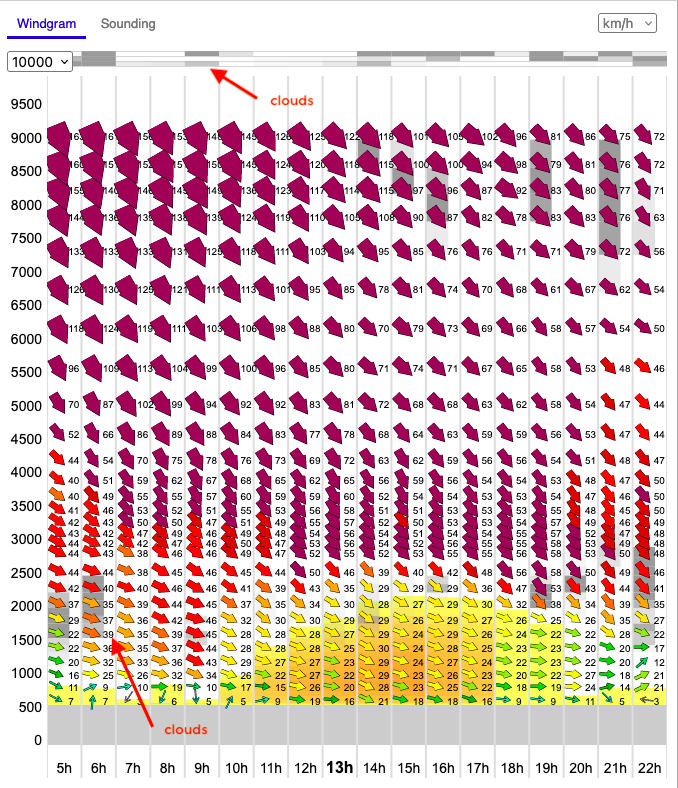
Clouds
It is important to understand the global atmospheric conditions, including cloud coverage at all levels.
The clouds are schematically represented at the top of the windgram across three atmospheric levels, low, medium and high. The darker the shade of grey, the denser the predicted cloud coverage at that level.
When we talk about cloud altitudes, the definition is as follows:
- low clouds: <2000m
- mid-level clouds: 2000 to 6000m
- high clouds: >6000m
Additionally, clouds appear as grey shades within the windgram at their corresponding altitudes. As before, a darker shade indicates thicker cloud cover.
Thermals and instability
After this global overview, it makes sense to zoom in at the flight level. Here, we’ve selected a scale up to 4000 m, even though thermals are unlikely to exceed 2250 m today.
To ensure safe flying, it is crucial to study the conditions above the instability level.
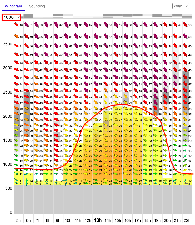
The varying shades of yellow on the windgram represent atmospheric instability: the darker the yellow, the more unstable the air.
Thermal activity typically follows a bell curve: as the day progresses, the air warms up, reaching peak thermal activity around 3 to 4 PM before rapidly fading after sunset.
One might notice that the presence of the clouds slows down or even reverses this process (compare 8 am and 9 am, for example).
Wind
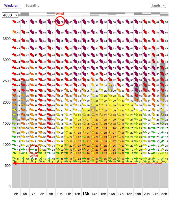
Of course, the primary purpose of the windgram is to visualize the wind. The arrows indicate both wind strength and wind direction — the thicker the arrow, the stronger the wind. Additionally, a color scale enhances this representation, transitioning from green (light wind) to purple (very strong wind), with intermediate shades of yellow and red to reflect increasing intensity.
Ground level
The last but not least, notice the absence of any data below 600 m (represented in grey). This is the ground level as seen by the model. It doesn't necessarily correspond to actual altitude of this flying spot.
This discrepancy is completely normal. Weather models work by approximation and use a grid with pixels a few kilometers wide. The altitude displayed is a calculated average over that area. This is not specific to Meteo-Parapente. There is the same behavior on all weather models: GFS, ECMWF, AROME, ICON....
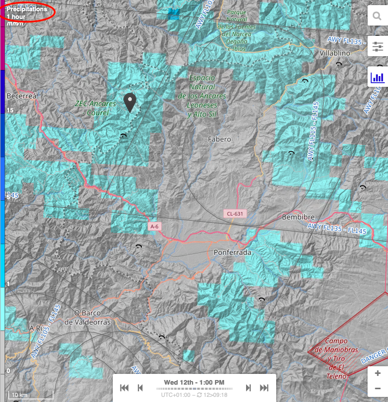
Precipitations
Sometimes at the bottom of the Windgram, just above the hours, a line of values appear. These are precipitations (to see an example, please visit Understanding Humidity Maps).
Understanding the Sounding Plot
By clicking on Sounding next to the Windgram, one can switch to the sounding diagram.
It provides critical insights for free-flight pilots. By analyzing thermal activity, stability zones and wind strength, pilots can determine safe and optimal flight altitudes for soaring and thermal use.
Compared to a classic sounding plot, Meteo-Parapente version is simplified and more comprehensive:
-
The altitude is displayed in meters instead of hPa (pressure levels).
-
The scale is linear, making interpretation easier.
-
Both the wind arrows (right-hand side) and the sounding curves are shown for the selected time (e.g., 1 PM in this case).
-
As the user scrolls through the time scale at the bottom of the map, the sounding curves and wind data dynamically update.
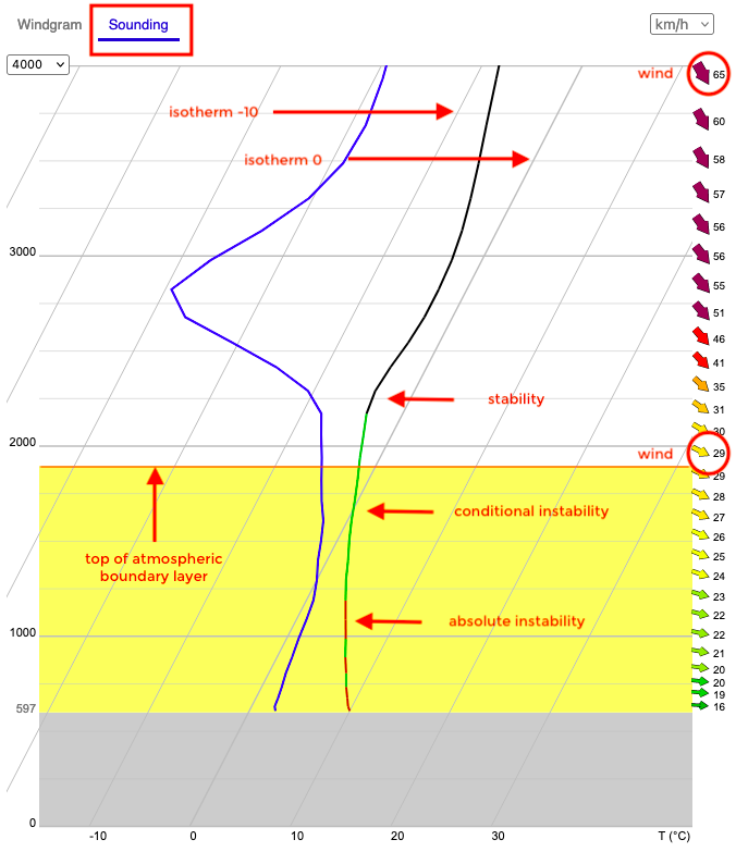
1. Temperature Profiles
- The black line represents the actual temperature profile of the atmosphere.
- The blue line represents the dew point temperature, indicating humidity levels and the likelihood of cloud formation.
- The area where both curves touch indicate precipitations (for more details, see Understanding Humidity Maps).
2. Thermal Stability & Instability Zones
- Absolute Instability - (yellow shaded area - sounding curve is red)
In this region, the temperature decreases rapidly with altitude, promoting strong thermal activity.
-
Conditional Instability (yellow shaded area - sounding curve is green)
Here, instability depends on moisture content. If the air is dry, it remains stable; if saturated, it can rise further, forming clouds. -
Stability (white unshaded area - sounding curve is black)
This region resists vertical movement, limiting further thermal development. -
Top of the Atmospheric Boundary Layer
Marks the upper limit of significant thermal activity. -
Vertical slanted lines represent isotherms (-20°C, -10°C, 0°C, 10°C, 20°C, 30°C, etc.).
3. Wind Profile
- Wind speed and direction are shown by arrows on the right-hand side.
- Thicker arrows indicate stronger winds.
- The color scale represents wind strength, transitioning from green (light wind) to purple (very strong wind).
- At this example, ~2000m altitude, wind speed is 29 km/h; at ~4000m altitude, wind reaches 65 km/h.
4. Key Observations
In this example, the pilot might draw the following conclusions:
-
Thermals are unlikely to exceed ~2250m, as the stability layer starts beyond this altitude.
-
Wind increases with altitude, which can significantly impact flight conditions. Overall, this day might already be too windy for paragliding.
-
The conditional instability layer suggests a potential for cumulus cloud formation.
Understanding the Wind maps
All wind maps provide a visual representation of wind conditions using arrows for wind direction and a color-coded scale for the wind strength.
To switch between various wind maps, click on the Menu button on the top right of the screen, then choose the right representation from the Wind drop-down list.
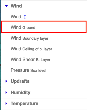
The most commonly used maps are Wind at ground level and Wind at various altitudes.
Understanding the Wind at Ground Level Map
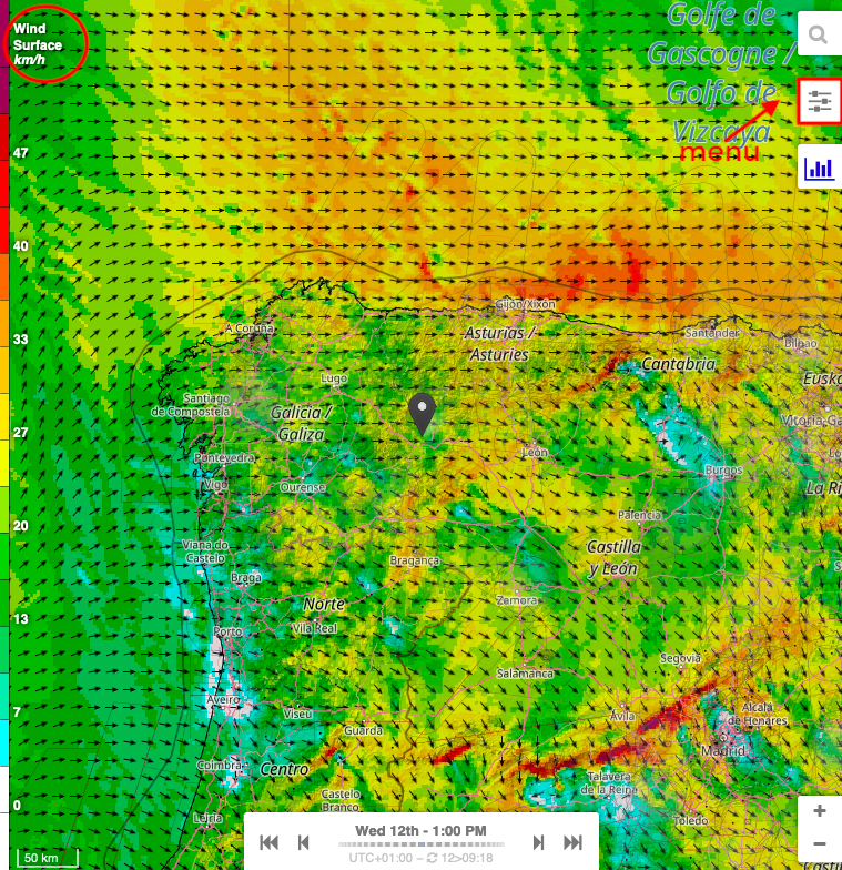
1. Wind Direction (Arrows)
-
The black arrows indicate wind direction (in this example, at the surface level).
-
The arrows point in the direction the wind is moving. The wind is following the arrows.
2. Wind Speed (Colors & Scale)
The background colors represent wind speed, with a legend on the left showing values in km/h.
You can change the speed unit in the windgram or in the settings menu.
-
Green shades → Indicate lighter winds (below ~20 km/h).
-
Yellow to orange shades → Represent moderate winds (between ~20 to 40 km/h).
-
Red shades → Indicate stronger winds (above ~40 km/h).
-
Dark red or purple areas (if present) → Represent very strong winds, potentially exceeding 50 km/h.
The color scale is designed for paragliding: green is safe, red is danger.
As the user scrolls through the time scale at the bottom of the map, the wind data dynamically updates.
Understanding the Wind at Various Altitudes Map
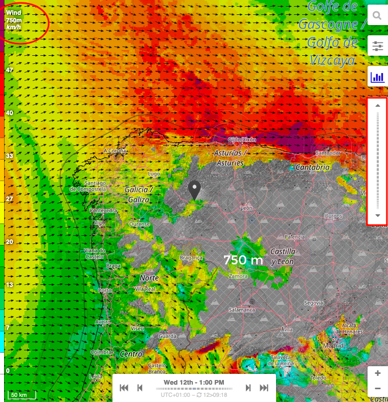
The wind at various altitudes map functions similarly to the wind at ground level map.
To navigate between altitudes, use the right-hand vertical scroller, which allows switching in 250 m increments.
-
The current altitude is displayed in the top left corner of the page (here, 750 m).
-
A grey-shaded area illustrates the mountain terrain as estimated by the model, signifying regions where wind data is unavailable, as there is no wind within the rocks. While some other websites may display wind data within the mountains, this is merely an unreliable interpolation intended to enhance visual appeal, and should not be trusted.
-
Naturally, as altitude increases, the mountain's footprint decreases, revealing more wind data at higher levels.
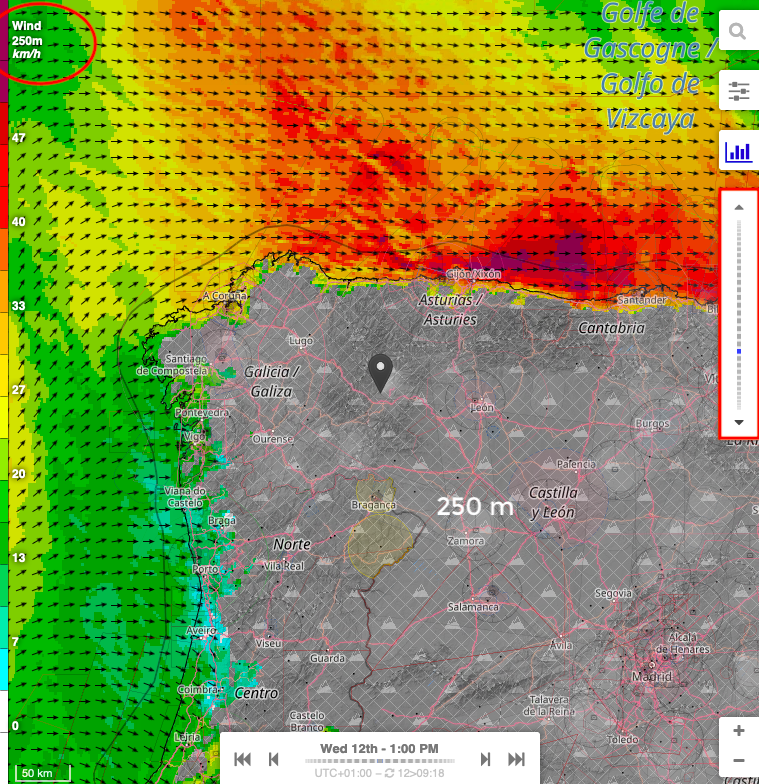
This visualization helps in better flight planning and understanding atmospheric dynamics.
Understanding the Mean Sea Level Pressure Map
This visualization represents mean sea level pressure (MSLP), a key meteorological parameter used to analyze atmospheric pressure patterns.
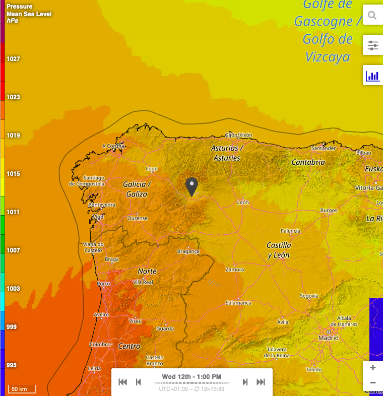
1. Color-Coded Pressure Levels
- The background color gradient represents sea-level pressure in hPa, as shown on the legend on the left.
- Higher pressure is indicated by warmer colors (orange, red).
- Lower pressure is represented by cooler colors (yellow, green, blue).
- The values on the scale (e.g., 995 hPa to 1027 hPa) indicate the pressure at sea level, not at ground level.
2. How to Interpret This Map
- Higher pressure areas (warmer shades, orange-red)
Typically associated with stable weather, clearer skies, and lower wind activity. - Lower pressure areas (cooler shades, yellow-light brown)
Indicate regions of potential instability, possibly leading to increased cloud cover, wind, and precipitation. - Gradual transitions between colors reflect changes in atmospheric pressure across a region.
3. Dynamic Time Navigation
- The bottom time slider allows users to scroll through the forecast, visualizing how pressure systems evolve over time.
- This helps in predicting weather changes, wind shifts and potential storm developments.
By analyzing pressure values and their spatial variations, users can anticipate weather trends, wind patterns and potential changes in atmospheric stability.
Understanding Thermals Maps
All thermal maps provide a visual representation of thermal conditions (updrafts and atmospheric boundary layer), helping the pilots identify the best lift areas, with stronger thermals typically forming over sun-exposed ridges and valleys. They are crucial for planning cross-country flights and understanding the day's soaring potential.
To switch between various thermals maps, click on the Menu button on the top right of the screen, then choose the right representation from the Updrafts drop-down list.
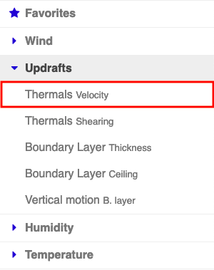
Understanding Thermals Velocity Map
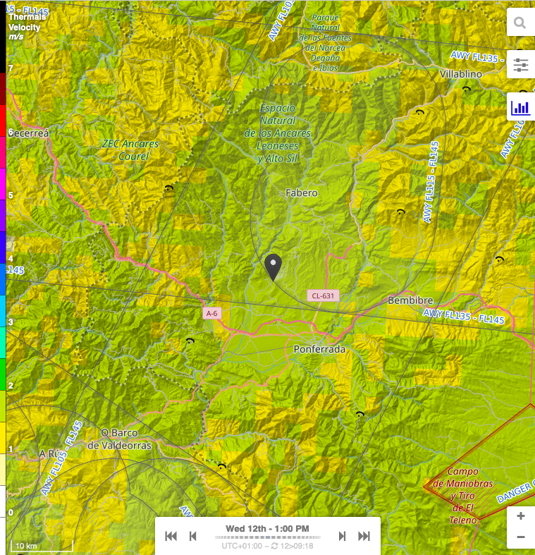
The Thermals Velocity Map displays the vertical speed of thermals (in m/s) at different flight levels, as indicated by the legend on the left.
- Yellow and light green shades represent weak thermals (0 to ~2 m/s).
- Darker green to blue shades indicate moderate thermals (~2 to 5 m/s).
- Purple and pink shades correspond to strong thermals (above ~5 m/s), which can provide significant lift.
Use the time slider at the bottom to analyze how thermal activity evolves throughout the day.
It is important to understand that this represents the average thermal intensity in the area. It is not the maximum speed you would see on the variometer in a specific thermal. This indicator is reliable, but it should be interpreted as a relative value rather than an absolute one.
Understanding Thermals Shearing
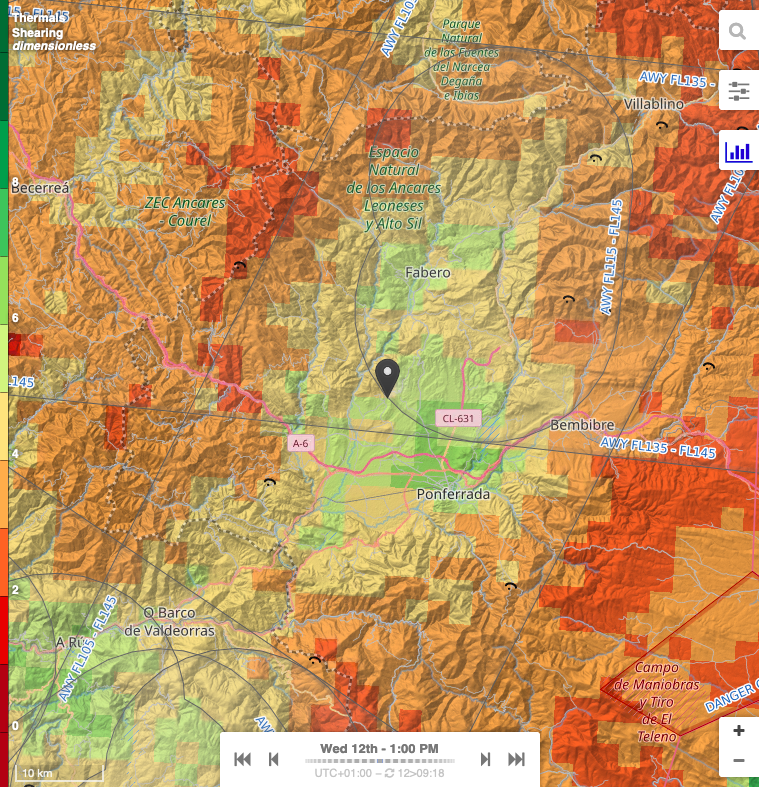
Thermals shearing map is dimensionless. Shear is a subjective indicator that evaluates the ratio between thermal speed and wind speed. It helps estimate whether the lift will be smooth and pleasant or turbulent and bumpy.
A green color (higher value) indicates the presence of thermals with little wind, resulting in more stable and comfortable lift conditions.
Understanding Boundary Layer Thickness Map
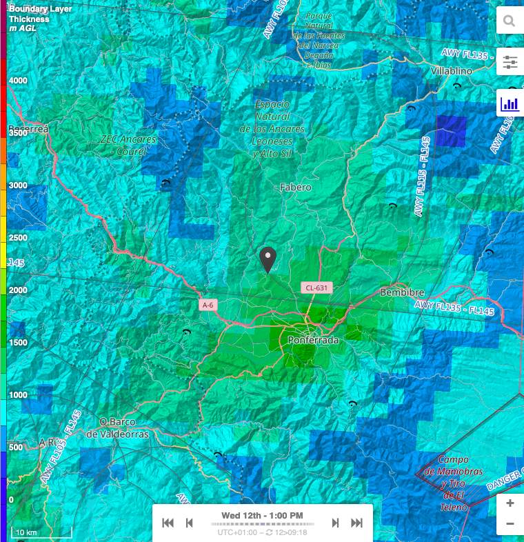
The Boundary Layer Thickness Map represents the height of the atmospheric boundary layer (in meters above ground level, AGL), as shown in the legend on the left.
The boundary layer represents the part of the atmosphere that is influenced by ground turbulence. This turbulence is created by wind or thermal activity. Under thermal conditions, one can consider that the thickness of the boundary layer is approximately equal to the height of the cloud ceiling and the base of the clouds (relative to the ground altitude).
The Boundary Layer Ceiling Map displays the absolute altitude of the top of the Boundary Layer (ground altitude + thickness).
- Green and light blue shades indicate a lower boundary layer (~500 to 2000 m AGL), where thermal activity is more limited.
- Yellow to red shades represent a higher boundary layer (~2000 to 4000 m AGL), allowing for stronger and more sustained thermals.
The time slider at the bottom allows tracking of boundary layer evolution throughout the day.
Understanding Humidity Maps
Humidity maps provide an overview of expected overcast and precipitations.
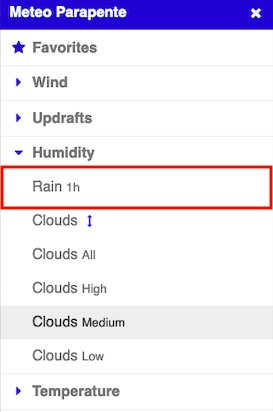
To switch between various humidity maps, click on the Menu button on the top right of the screen, then choose the right representation from the Humidity drop-down list.
Understanding Precipitations Map
This map displays hourly precipitation (mm/h), indicating areas with expected rainfall.
It is important to understand that accurately predicting rainfall is quite challenging, and ALL models, including Meteo-Parapente, ICON, AROME, ECMWF, and GFS, struggle with this aspect. It should rather be considered as an indicator of the risk of rain rather than an absolute value.
It helps pilots avoid areas with rain that could affect flight safety. It also identifies moist zones where cloud formation may impact thermal activity and limit the possibility to take off or land.
- Light blue shades → Indicate light precipitation (~0 to 5 mm/h).
- Darker blue to purple shades → Represent moderate to heavy precipitation (>5 mm/h).
The time slider allows tracking of precipitation changes over the day.
The precipitations also show up at the bottom of the Windgram:
Understanding Clouds Map
All Clouds maps are similar, but the Clouds at Various Altitudes map allows you to navigate different altitude levels, whereas the other maps focus on specific altitude zones. We will therefore only discuss one of these maps.
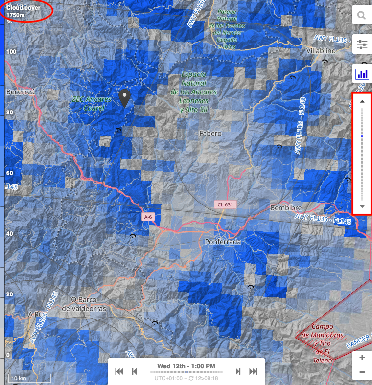
This map displays cloud cover percentage at various altitudes. It identifies potential cloud layers ☁️ that could affect visibility and helps locate clear areas with better thermal development.
To navigate between altitudes, use the right-hand vertical scroller, which allows switching in 250 m increments.
The current altitude is displayed in the top left corner of the page (here, 1750 m).
The color legend is as follows:
- Light gray → Clear sky or very low cloud cover (~0-20%).
- Light blue to dark blue → Increasing cloud cover (~20-80%).
- Darker blue shades → Indicate dense cloud coverage (~80-100%).
As usual, the time slider helps track cloud evolution during the day.
Understanding Temperature Maps
Just like with the wind maps, there are two temperature maps, one at varying altitudes and another one at ground level.
As usual, in order to switch between two, click on the Menu button on the top right of the screen, then choose the right visualisation from the Temperature drop-down list.
Understanding the Temperature at Ground Level Map
This map shows air temperature at 2 meters above ground level (AGL), crucial for understanding surface heating and thermal activity.
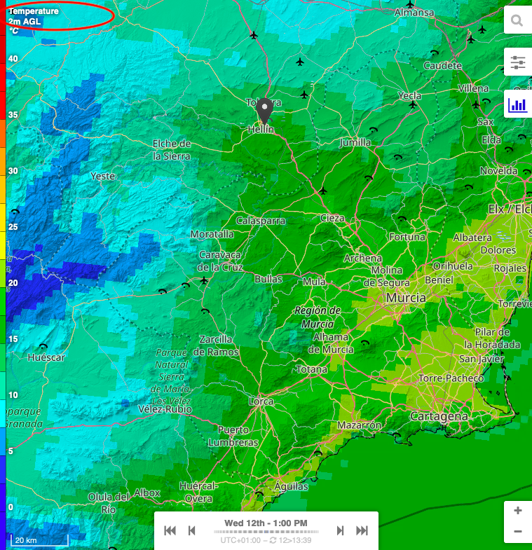
The legend is as follows:
- Dark blue to cyan → Cold temperatures (~0-10°C).
- Green to yellow → Mild to warm temperatures (~10-25°C).
- Orange to red → Hot temperatures (30°C and above).
As the user scrolls through the time scale at the bottom of the map, the temperature data dynamically updates, showing the evolution during the day.
Understanding the Temperature at Various Altitudes Map
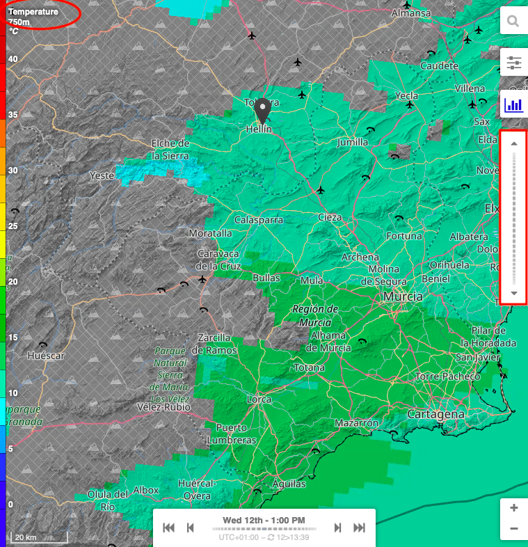
The temperature at various altitudes map is very similar to the wind at ground level map.
Here are the main differences:
-
To navigate between altitudes, use the right-hand vertical scroller, which allows switching in 250 m increments.
-
The current altitude is displayed in the top left corner of the page (here, 750 m).
-
A grey-shaded area represents the mountain terrain as seen by the model, indicating regions where no temperature data is available.
-
Naturally, as altitude increases, the mountain's footprint decreases, revealing more data at higher levels.